Social Media Drink Presentation: How to Design a Photogenic Latte
Use colour, glassware, garnish, lighting and mobile-first framing to make café drinks stronger on social and web.
PISTALATTE Editorial••1 min read
Make the product recognisable first
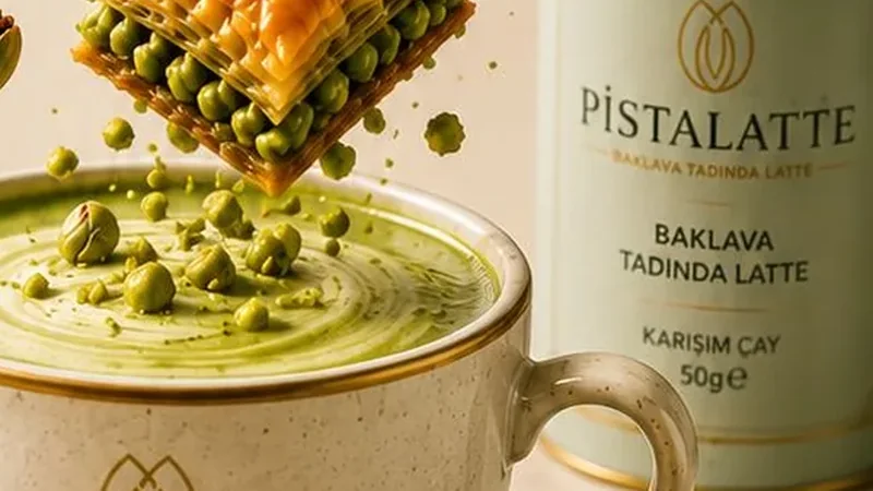
Photogenic does not simply mean beautiful. A scrolling guest should quickly recognise the drink, colour and brand character. Pistachio tones, warm cream surfaces and deep green branding create a coherent visual system for Pistalatte.
Balance glassware and garnish
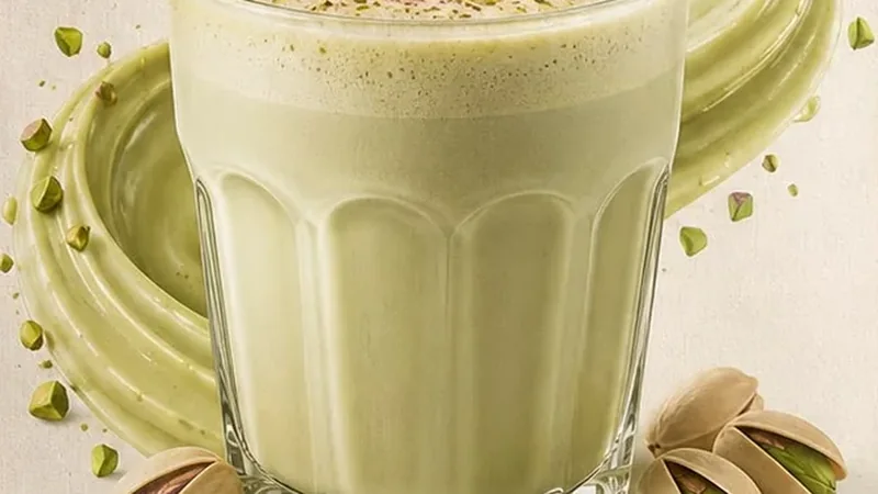
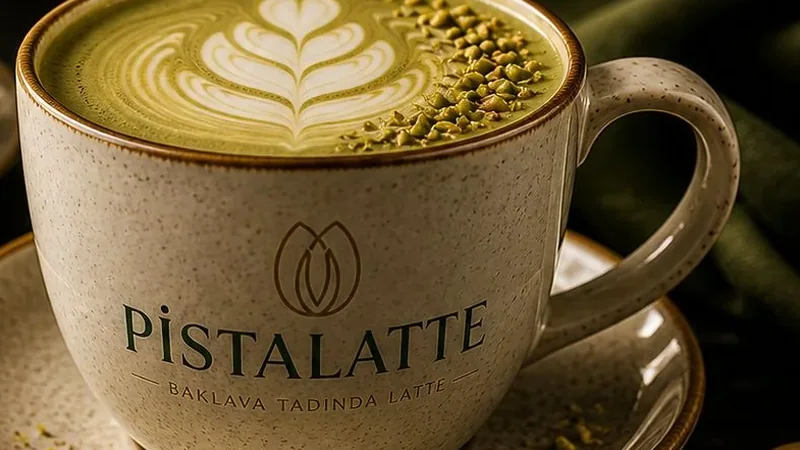
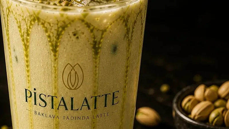
Too much decoration can hide the drink. A small amount of pistachio, controlled drizzle or clean latte art is usually enough. For iced drinks, transparent ice and glass shape add texture without clutter.
Frame for mobile separately
Cropping a wide website banner into a story often destroys the composition. Portrait content needs safe space, strong product placement and text kept away from screen edges.
Keep colour credible
Over-saturated green may grab attention but can create a gap between photography and the drink served. Staying close to the real product tone supports trust and a more premium brand impression.